When we first started shooting our film this was the original logo:

It was something Adam had quickly mocked up that we put as the header on our blog. We kept this logo for awhile however we soon grew to dislike it.
Paul initially said to us it didn’t look good as it was too ‘cartoony’ and the blood didn’t look realistic at all. Which we agreed with. And as soon as we found out that we would be marketing this film the first thing we decided to change was the logo.
As Adam had made the first logo he took it upon himself to change it up and create some new designs, this is what he sent to us:

We all gave our feedback and together decided we liked the top right design the best. However we thought it needed a few improvements.
We liked that on the first design it had a dark background making it look more gothic and horror themed, however when we tried it out we realised that you couldn’t read the end of the logo, as it was black font.
We tried putting a moonlike light behind the logo and this is what we came up with:

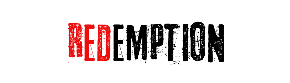
We used this for awhile even though you couldn’t really make out the end of the word, that’s when we decided just to make the whole text red.

We decided to keep the moonlike light as it added a bit more to our logo and made it seem a bit more dimensional and interesting than just typing on a page.
When we first set up our Facebook Page we had this picture as the profile photo:

This picture was just something we found (and stole) off google whilst we created a better one. We knew we wanted our little logo to be lips with fangs hanging out, as the vampire in our film is a woman and we thought that the lips seemed quite feminine. Plus it’s an easy way to spot a vampire.

This is the logo Harrison created after we pitched all our ideas.
